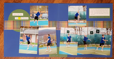
Here's a layout using another one of Cheryl's sketches, Sketch16aug3, from SCS (Splitcoaststampers).
I didn't have any landscape photos so I cut two vertical photos down. The SU Brilliant Blue base works well with the colors in the photo. The circles are SU Garden Green because from my thousands of pieces of cardstock I didn't have anything close to the color of a tennis ball! The strips of DSP are from DCWV High School Paper Stack & I used a few pieces of Little B's Washi Tape. The only embellishment I added was a brad that says "Tennis" in the title. The sketch has more embellishments but I couldn't find anything else that fit. I'm sure I have something but after organizing them last year I can't find anything...LOL! I think it looks bare so I'll just have to keep an eye out for something that I can add later.
Well on to another project...TFL!

No comments:
Post a Comment