Many years ago, my sister (-in-law), Judy, Retired2stamp, invited me to a Stampin' Up Party. I was drawn to the 6X6 recipe card swap our local group was doing and had wanted to scrapbook too. I wasn't really interested in card making because I had witnessed my brother (in-law) Ed fold up a handmade card and put it in his pocket. I almost fainted and I didn't even make the card. But after a few parties, I was hooked and now make more cards than I had ever thought I would. My most recent passions are ATCs, tags & altered art. As you look through my blog I hope you can see how I've grown in my crafting ability!

Tuesday, November 27, 2012

Face Painting at the Zoo

This page was for Splitcoaststampers Digital Scrapbooking Progressive Challenge 6.  The link is to Step #1 in case you'd like to see the progression but this post is the 4th & final step.  This was my first progressive challenge & I must say it WAS challenging. Sometime it's hard not to add something not listed but I will definitely play along again!!  Also you can probably tell but it's not digi.  Task 1 was to have 1 or several photos in the middle of the page to cover the entire width of the page with a small strip above & below the pic.  Then add another photo at the bottom left with something vertical on the left.  Task 2 was to add color or grunge at the top left so I sponged...I wished I would have used a spritz.  Task 3 was to add a strip so I did at the top  Below are more of the parts of the tasks that involved the photo in the lower left.


This section of the layout covers all 4 of the tasks.  Task 1 started out with the picture, which is popped out & vertical photo strip.  For Task 2 I added the easel, paint tubes, dog bone (thanks to Diane for the suggestion), library clip & tag.  The 3 circle mirrors, smile photo strip & string was added for Task 3.  The journaling at the right was part of Task 4 & is popped out too to create a shadow.
 
This is part of Task 4 which is to add a title. I used 4 different types of letters plus I added paw prints for the dog (there are 4).  The word "face" is a silver foil, "Painting" looks like water colors, "at the" are blue & green, "ZOO" is an animal print.
 
What a fun layout and yes, there will be a second page to this LO which will be more pictures from our visit to the Philadelphia Zoo in October 2011!!
 
Supplies:  Paper - DCWV Indian Summer Fall Pack; Tim Hotz - Film Strip Die; Reflections - paint tubes, easel, Nicole - 1/2" round glass mirrors; Awesome Albums - Trademark Mini Film Strips;  Stamps - Hero Art Animal Prints; SU Mini Library Clip; Miss Elizabeth Scrapbooking Embellishments - dog bone; Unknown baggage tag; Alphabets - American Crafts Cinnamon Foil (Face), EK Success Watercolors (Painting), Simple Crafts (at the), Reflections (ZOO).


Wednesday, November 14, 2012

Lisa's Birthday Card


As the title says, this is Lisa's (SCS Runswithscissors) birthday card.  Lisa is the only NEPA Giggle who has a November birthday so she was the guest of honor at our Gigglefest tonight.  Another night of good food & lots of laughs!  Well onto the card.  The only thing that's not Stampin' Up is the inside sentiment which is shown below & is specificly for a November birthday.  It talks about orange, red & gold leaves so I had to go with the leaves on the front.  I decided on the oak leaves because I wanted to use the acorn.  They are from a 2 step set but I didn't have good luck with it so after stamping one of the steps, I cut them out then sponged the edges in a co-ordinating color.  Lisa said the sentiment is one of her favorites...how lucky is that!


This is the inside of the card...don't you just love the sentiment?  There are 12, one for each month.  I did do the 2 step for the acorn.  It's OK but I've got to practice on them.                                                                             Happy Birthday Lisa!! 

Supplies:  Cardstock - Early Expresso, Very Vanilla, DSP Autumn Traditions ; Stamps - SU Gently Falling, SU Perfectly Penned, "05 DRSU (November sentiment); Ribbon - SU Theater; SU Ink - Early Expresso, Soft Suede, Pumpkin Pie, Apricot Appeal, Riding Hood Red, Cherry Cobbler, More Mustard, So Saffron.   

Sunday, November 11, 2012

Christmas Traditions 2012

This 2 page layout is for two challenges, the Splitcoaststampers Digital Scrapbooking Day Celebration & the My Favorite Things Scrapbooking Challenge.  The details are below. 


This is my final page & the 5th challenge for the Splitcoaststampers Digital Scrapbooking Day Celebration.  Yeah, I got all 6 done (I did #6 before #5)!!  The challenge from Terri (SCS 3Fries) was Persnickety Holiday Preparations & it had to be about a holiday tradition you are fussy about & you  had to use the word persnickety on your layout.  Now I really had to think about this one because I'm no persnickety about much.  In our house the motto is "it's good enough for who it's for"...that's according to my DH.  Of course in the past it has backfired on him!!  This page was a project we did at Faye's SU party a few years ago.  It was her design & I put it together.  I thought it went perfectly with my persnickety holiday tradition!


This page is for Splitcoaststampers MFT (My Favorite Things) Scrapbooking Challenge.  There were a couple of layouts you could chose from & I didn't follow it exactly.  I flipped the 3 photos from the left side of the page to the right side & put the other photo at the top instead of the bottom.  I figured it would be OK since I saw other LOs in the gallery that had been changed.   I did a continuation of the left page of Santa's suite & since the buckle was on the other page I left this blank.  I was going to tuck a glove into the belt but decided I wanted to add more journaling. 


Supplies - Card stock/paper - SU Textured Cherry Cobbler, SU Textured Basic Black, SU Whisper White, SU Gold, SU Cherry Cobbler DSP; Ink - SU Cherry Cobbler. 

Saturday, November 10, 2012

Learning to dive at Camp Poppop 2012


Here's challenge #3 for the Splitcoaststampers Digital Scrapbooking Day Celebration Challenge from Terri (SCS 3Fries)  She provided a link to Stampin Up who was celebrating DSDC by giving away 3 free downloads & 50% off some others last week.  Terri's challenge was to follow the links & use one of the free downloads. For traditional scrappers she asked us to use chevrons, arrows & great colors.  I really had to search for paper with chevrons but I found one in orange in a 6X6 pack from BasicGrey.   I  thought orange went pretty well with teal which went with the diving photos and a page was born!  I decided to mix up the fonts for the titles.  I used rub-ons, a die cut, stamped cut out numbers plus one that was printed from Word.  I had just purchased the arrow sizzlet from the SU clearance rack...how lucky was that?   I wasn't sure how I was going to use the chevrons or arrows but once I got started it just fell in place...thanks Terri for a fun page!  I  matted the photos & journaling in paper from a DCWV stack.  I also downloaded the free digi kits so I can start looking at digi scrapbooking.  On to the last challenge #5!  I think I'll be able to get them all done by tomorrow night...YEAH!!      


Supplies:  Paper - SU Taken with Teal CS, DCWV Indian Summer Fall Stack (orange), BasicGrey Plumeria (chevron); Stamps - SU Alphablock Numbers; Misc - Autumn  Leaves Rub-on Letters, EZ Laser Design Poppop Die Cut, SU Sizzix Sizzlet Curves Ahead,

America's Pastime

This layout is for the Splitcoaststampers Digital Scrapbooking Day Celebration Challenge which started last week.  The LO covers Challenge #4 & #6.  The deadline is tomorrow night, Nov 11th around 11pm so I have 2 more challenges to do before then.  These layouts will also count towards my November goal of 8 pages...now I only have 3 more so I should be done tomorrow too!


The left page is for Challenge #4 from Wendy B (SCS Wendella247) & was to use colors from our country's flag (some scrappers are from other countries).  We were also directed to Kristins Scrap Design for a free digi LO design from 2011.  I'm a traditional scrapper so I just followed the LO.  I didn't have any patriotic photos but since baseball is called America's pastime I decided to use that as my subject.  I found the background paper in my stash which tied into the patriotic, red, white & blue theme.  The white 8X8 center is matted in SU Brilliant Blue then stamped with matching blue stars then I sponged over it with SU Real Red.  I'm really not sure what to call the other image I stamped in Real Red.  I wrote the year on the jewelry tag & looped it over the baseball brad in the upper right of the photo.  There's a bat & ball sticker at the bottom right of the photo.  I was inspired by the title from Wendy's LO so when I stamped the title I alternated the colors & then cut them out.  

The right page is Challenge #6 & also from Wendy B (SCS Wendella247).  We were give an option to either use a design from a past challenge by Patti"s (SCS princessp1971) or Sally (SCS showmestamper).  Because of the # of photos, I decided to use Sally's challenge #38.  I wanted to co-ordinate this LO with challenge #4 (remember I'm a 2 page girl) so I matted the photos.  Sally used a torn piece across the center so I stamped & sponged it to matched the left page.   I have a lot of pictures printed & ready to go so it took me all week to decide which to use on which challenge.  Once I did it went pretty quickly & I'm so glad I'm using things from my stash!  I'm sorry the photos are so dark...I need to work on photography skills!
 
Supplies:  Paper - DCWV Summer Stack, SU Brilliant Blue, SU Whisper White; Stamps - SU Shooting Stars, SU Alphabet Attitude Upper, SU Alphabet Attitude Lower; Punch - SU Jewelry Tag; Ink - SU Brilliant Blue, SU Real Red; Embellishments - EK Jolee Baseball Stickers, Special Moments Brad, DMC floss, sponge.

Sunday, November 4, 2012

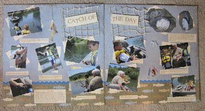
Catch of the Day

Well as you can see I'm back to a two page layout.  I'm like that potato chip commercial...bet you can't make just one...LOL.  Well anyway, this is the 2nd challenge of 6 for Splitcoaststampers Digital Sscrapbooking Day Celebration.  Again I'm a traditional scrapper but everyone was welcome.  I have until 11:30pm next Sunday to complete the other 4.  It was designed by Wendy B (SCS wendella247) & her challenge was to:
  1. Use at least two shaped photos (anything other than squares or rectangles).  I used a lot of rectangle photos (12) but there are two in the upper right corner of the 2nd page that are shaped different.  I used the Spellbinders Large Deckled Rectangles on all the photos but those two I turned them a little & ran them through the Cuttlebug again so they're no longer a rectangle!  Challenge met!
  2. Use at least 2 background papers.  My 1st background paper is a blue distressed Huckleberry Pond paper by The Paper Loft.  The 2nd background paper is from The Paper Loft too & is from a pack of Hooked on Fishing.  I placed a 2 1/2" strip at the bottom of each page so it appeared the fish were swimming in the water below the blue sky.  Challenge met!
  3. Use some rickrack.  I had rub-ons by Martha Stewart that were different colors of rickrack so I used the blue at the top of the fish paper to simulate waves.  Challenge met!
  4. Use a title & at least one line of journaling.  The title I used was from an accessory sheet titled Here Fishy, Fishy by The Paper Loft. I cut it in half & put it on both pages.  I did a lot of journaling lines.  Challenge met!
  5. Use 3 clusters of 3 or more items.  This was the hardest part of the challenge.  Cluster 1 was 3 fish cut from a left over piece of paper & hung on a stringer (a piece of  DMC  floss).  Cluster 2 are 3 fishing hook eyelets from The Eyelet Outlet.  Cluster 3 are 3 fishing lures stickers from EK Jolee.  Not sure I like them but I couldn't come up with anything else.  Challenge met!

The close up at the right shows the fish on the stringer.  I also used a piece of twine net on each page the used dimensionals to put the title over top of it.  I bought a large piece of this netting at the CKC in Lancaster this summer.  Didn't have any idea what I was going to use it for but it looks like I found one!

Thanks for looking! 


Supplies:  Paper - The Paper Loft 's Huckleberry Pond, Hooked on Fishing & Here Fishy, Fishy accessory sheet; Dies - Spellbinders Nestabilities Large Deckled Rectangles; Accessories - Mon Ami Gabby netting, The Eyelet Outlet fishing hooks, EK Jolee stickers; Martha Stewart rub-on rickrack, DMC floss, glue dots & dimensisonals..

Saturday, November 3, 2012

HoHo...OhOh, CRBT


It's very unusal for me to do a 1 page layout but this is for 
Splitcoaststampers Digital Scrapbooking Day Celebration Challenge & who knows maybe I'll add the 2nd page later!  Although the day is for digi, all scrapbookers were welcomed.  This is not digi & I used supplies in my stash (YEAH) & it's not a kit.  Terri (SCS 3fries) designed the 1st challenge which was to do a CAS (Clean and Simple) LO using ONE photo (stacked if you like), no layers just a great background paper. You could use other papers to fill punches, & minimal stamps & embellishments! Use texting/chat or Twitter lingo in your title or journalling!  I just loved this pic of poor Zach so it was perfect for this LO.  I only had 1 pic so I copied it.  They didn't turn out very good but you only see the edge.  After I layered them, I didn't like how the layers looked at the bottom so I covered it up with my journaling panel.  In the upper left corner I added a holly brad. For the title I had two embellishments that said HoHoHo so I cut them apart & turned one upside down so it would say H0H0 OHOH then added the texting lingo CRBT (Crying Real Big Tears...perfect huh?).  It's hard to see but the HOHO came with a little bling on it.  I have to admit although I text I don't use lingo much & had to research it.  That was the hardest part of this challenge...LOL!  Thanks Terri for a fun challenge!!  

Supplies:  Paper - BoBunny 12th St Nick Holly Berry, SU Very Vanilla CS; Embellishments - EK Jolee's (HOHOHO), SimpliCraft sheet of sticker letters (CRBT), unknown brad. 

Tuesday, October 30, 2012

Decorating Zach's Christmas Tree

This is my last October layout for Splitcoaststampers Scrapbook Goal Challenge.  It's a monthly challenge and for October my goal was 8 pages and I MADE IT!!!  I probably mentioned it before but I joined the group in September.  I decided to start out with a goal of 4 pages and reached it well before the end of the month.  So for October I decided to go out on a limb and double my goal.  Since the holiday's are coming I think I'll try to do 6 in November and 4 in December.  I am so glad I joined because I would have never done so many layouts.  The girls are very encouraging and supportive.  Their theory is any page done is good and it doesn't matter if it's a digi, a kit or your own design!  Well on to the layout....


This layout is not my design or a kit, it was from a Scrapbook Shoebox Swap our group did a few years ago.  Each person attending was assigned a holiday or special day like birthday.  You needed to make one completed two page layout to be used as a sample then supply everything for the others to do.  That included cutting everything so the layout only needed to be assembled and embellished.  You set up your sample and supplies then explained it to the group.  We then rotated to each project and at the end of the day we ended up with 18 COMPLETED two page layouts  I always enjoy attending events like this.  Not only do you end up with nice projects but we always have a lot of fun plus a great lunch.  I'm not sure who designed this layout but when/if I find out I'll come back and post her name so she gets credit for such a cute design.  Again the pictures don't do it justice...I think I need a new camera.  The paper on the left page is similar to SU's Cherry Cobbler with gold dots.  I'm think the "Just Believe" was done on a Silhoutte or a Cricut.  The pictures are double matted and the red plaid is so pretty I hated to cover it up so I cut the pictures a little smaller so it shows as much as possible.  The pictures I chose for this layout went very well with the layout since it has a cute tree on the right page.  I feel like I'm cheating because I've had this layout together for awhile but even adding the pictures and especially journaling never got done before and now I am!


This detail is so cute.   The stars are non-traditional and are hanging from string of beads.   Thanks for looking!
 
Supplies - I'm sorry to say can't post the company names for the supplies because I didn't do the design.  


Sunday, October 28, 2012

Ginny's Cookie Treats

Something a little different for my project today.  This is a gift basket for our local Abuse & Rape Crisis Center.  They're having their annual silent auction on Saturday so my two sisters (in-law), Pam & Judy & I decided we wanted to make a donation.  Pam & Judy provided most of the material & I assembled it.  Judy gave the basket, bead board, faux cookie & a bunch of white & green pine picks.  You can see the faux cookie hanging on the front of the basket.  I happened to have twill ribbon with gingerbread men & candy canes so I hot glued it around the top of the basket


Pam was selling her collection of Department 56 lighted houses so she donated Ginny's Cookie Treats from Elf Land which is part of the North Pole Series.  This is a limited edition set of 7 which I think came out & retired in 2000.  It includes a lighted building, 3 pine trees, 2 figurines and a bag of snow.   We collected these buildings back in the 90's.  My attic is full of them & what a shame I don't put them up any more.  My grandson, Zach found them in the attic & is insisting we set it up.  Now that he's older I may put some of them up this year.


In the bottom of the basket I put in 2 layers of 2" white bead board.  This stuff is easy to shape & will hold picks & trees plus you can even shape it with a wire brush to build mountains.  Of course that can get a little messy.  The building has a couple of small holes in the bottom so I poked shortened wooden skewers into the bead board and slipped the building over them to anchor it down.  From there I added the white & pine picks in the background & put the bead picks in between. I wove the red bead garland in through the trees.  Next, the figurines & trees that came with the set are hot glued in place.  I also added a bag of flour (behind the sign) & sugar.  Finding accessories that are scale is very hard but if you're baking alot of cookies would you want BIG bags of flour & s ugar?.  Once everything was in place, I sprinkled 

Viola, you have a whimsical Christmas scene! 

Sorry this post has odd spaces...I had problems tonight.

Thanks & hope you enjoyed looking.


Saturday, October 27, 2012

Splash!

This is another adorable kit I purchased at the Scrapbook "Fun" Addicts  booth at CKC Lancaster this year.  It was designed by Terri Zaelit & is so cute!  Don't you just love that duck in his tube?  He was so easy to assemble!  Terri's design has five 4X6 double mats but my pictures wouldn't fit.  In their instructions they tell you it's the suggested layout but to have fun with it...so I did.  I used six pictures with the bottom mats measuring 4X4 & each layer is 1/4" less.  All the white mats are sponged to match the color of the bottom mat.  I did simple journaling below the pictures in white card stock sponged red with red lettering.  Each set of 3 photos are arranged in a sequence & once I had them arranged, there was a lot of blank space at the top.  This wouldn't have happened if I had followed the original design.

I was at a lose how to fill the space & one of the NEPA Gigglers, Mary Ann suggested a "spray of water" to match the splash in the picture.  It's a little hard to see but I used 3D clear lacquer & just randomly applied drops of "water". I may have gotten a little carried away but it filled the space perfectly! Thanks Mary Ann for the suggestion, I just love it! The duck is accented with a white gel pen & the dots on the tube are small punched circles...yes, the dots were included in the kit too. They thought of everything.  I used a glue pen to put them in place.

Hope you enjoyed & thanks for looking!!


Supplies:  Kit by Scrapbook "Fun" Addicts ; SU inks; 3D Clear Lacquer


Our Camping Vacation

The subject for this layout is our camping trip to Lake George, NY in 2010.  It was HOT & then it RAINED but we still had a great time.  We've camped there  before & hope to go back again.  This is a kit from The Paper Loft.  Each year I love taking their classes at the Creating Keepsakes Convention (CKC).  If you're a scrapper & have never attend one of the CKC events you should go at least once.  This year, CKC moved the PA event from Valley Forge to Lancaster.  Good move CKC!  I usually attend with other NEPA Gigglers & this year it was with Lisa, Jeannette & Shannon.  As usual, we had a fabulous time!  Great shopping, food & a lot of laughs!  The Paper Loft has high quality paper, great designs & their classes are very well taught.  Not only do they have kits, they also have packs of paper & accessory sheets.  This is another company that you'll see on my blog in the future.  The title on the left page was torn at the bottom & the sponged, as were all edges of the mats & accessories you'll see.  I used Color Box Chalk Chestnut Roan.  The lantern was cut out & then popped up & you'll see more of them in the rest of the layout.  The page on the right has a cute camping list & I checked the items we took with us.  To the right is a mini album.  This is such a great idea so you can add a lot of pictures.  The Paper Loft uses this concept quite often with other kits too.  Lisa suggested I post the other pages of the mini album and it was a good one!  I used another sheet of their paper to print off my journaling.  I randomly cut the journaling out & sponged the edges then mounted them on the pages of the mini album.  Now you're probably wondering how you can look at pages once its in the page protector.  Before adhering the mini album on the 12X12 sheet, you place the base sheet in the page protector.  Then cut a slit in the page protector just wide enough so you can slip the last page of the mini album into the page protector and adhere it to the 12X12 page.  When you cut the slit, you'll need to open to the last page & measure because the mini album is bound at the top & it won't slip all the way in the protector.  Also, remember to put something inside so you don't cut the base paper.  The mini album will be on the outside of the protector (except the last page) so you can open it up to view the pictures.  Cute, huh?  I have to say I don't think these pictures do justice to the layout.  In person, the colors are brighter so I hope you check out the website links above for The Paper Loft & CKC too.  Thanks for looking!


Supplies:  Kit - The Paper Loft; Ink - Color Box Chalk Chestnut Roan

Friday, October 26, 2012

Scarin' the Crows?

Two more pages done!!  This was a kit I purchased from  Scrapbook "Fun" Addicts  in 2011 at the CKC Convention in Valley Forge, PA and was designed by Elicia Simon.  I must say it's so cute and a perfect fit for these photos!  If you're new to scrapbooking or just don't want to design yourself, this is a great company to buy from.  They have a good variety of kits at reasonable prices and the instructions are sssoooo easy to follow.  Everything is die cut so all you have to do is put it together!  I can tell you this won't be the last LO from Scrapbook Funaddicts you'll see here.  If you go to their site and look at this layout, you may notice that I embellished it just a tad.  I didn't have photos that were portrait so I cut two of them down and added a panel for my journaling.  There was enough card stock left so the journali mats match perfectly.  On the left page, I made a boo boo when I measured so I added a knotted piece of twine between the photo and the journal panel.  To match it, I added a "rope belt" to the scarecrow.  On the right page, I needed to cover something up in the top photo so I made another crow.  It's not as cute as Elicia's but it'll do.  I sponged the edges of everything with chestnut roan chalk from Color Box. 

I had to add a close up of Elicia's crows because they are adorable.  The eyes are drawn with a white rollerball pen.


Supplies:  Kit Scrapbook "Fun" Addicts ; Color Box Chalk Chestnut Roan; SU Natural Twine.


Wednesday, October 10, 2012

Scary Halloween Pop-up ATC


This ATC is for a swap the NEPA Gigglers are doing at Mary Ann's (Geraldinesmom) SU party. I saw a tutorial for a Surprise Pop-up Card by Beate on Splitcoaststampers & I thought an ATC would be cool.  Cyndi Evans has posted the ATC dimensions at the bottom in the Question & Comment section.  I highly recommend watching the tutorial before starting.  This will give you the entire process (which I'm not going to type) plus if you use my dimensions then they will make more sense.  I did make changes to fit my design. Here are my layers:  Perfect Plum base - 3 1/2" X 2 1/2"; Basic Black - 3 1/4" X 2 1/4", Brown - 3 1/8" X 2 1/8", DSP - 3" X 2", black slider - 2 7/8" X 1 3/4" , paper slider guide - 4" X 1/4".  I  used DSP so it would look like grass & mounted it on the black leaving a 1/8" edge.  I then cut through both layers, 1/4" from the edge of the DSP making 2 cuts 2 1/2" long &1 cut 1 1/2" wide.  I found cutting with the DSP up worked best so I could see what I was cutting & it kept the cuts smooth.  I didn't want to make pencil marks on the DSP so I used the lines on my cutter & the blade as a guide.  I only added the brown layer so it would look like a grave for the "surprise".  The ghost is stamped & hand cut.  He's woven in through the tree which is cut from the Cricut.  I used 2 layers for the trees because their size (2 1/2") made them very delicate.  In front of the tree is a Memory Box die cut wrought iron fence which I trimmed on one side.  Then I popped out the tombstone &  pumpkins.  The pumpkins were colored with Copics & then I used Crystal Effects for a little dimension. 
 

Here is a side view when the slider had been pulled!  Cute huh?  I enjoyed making this into an ATC but I do think by adding the DSP it was a little harder to cut.  If you've never made one, I'd recommend doing a card first. A big thanks to Mary Ann for cutting the trees out and letting me borrow her stamp set.  She's the queen of Halloween!!
 
Supplies:  Card stock - SU Perfect Plum, Basic Black, Basic Brown, Whisper White, DSP Cast-a-spell; Stamps - Spooktacular Greetings; Cricut - Happy Hauntings; Die - Memory Box Wrought Iron Fence; Misc - SU Whisper White Ink, Copics, bright green eyelet, SU Black Hemp, SU Crystal Effects, dimensionals, double sided 1/4" tape.


Tuesday, October 9, 2012

Mary Ann's Halloween Birthday


One of my good friends, Mary Ann, who is also a NEPA Giggler, is an October birthday girl.  She LOVES Halloween so it was a no brainer to make her birthday card with a Halloween theme.  I hate to admit it but I used a stamp set I borrowed from Mary Ann to make her card...LOL.  After embossing the pumpkins, I took my black stamp pad and rubbed if over top on the reverse side.  The black mat is die cut using a Spellbinders as well as the green, which was placed on the black mat at an slight angle.  All the edges are sponged in black.  I printed the sentiment for the sign and cut it out by hand.  The sentiment on the inside of the card was found online (can't remember where) but I changed it a little to read:
When black cats prowl,
and pumpkins gleam,
may your birthday
be as fun as Halloween


Supplies:  Card stock - SUDSP Cast-a-spell; Stamps - SU Spooktacular Greetings; Other - Spellbinders Lg Deckled Rectangle, Cuttlebug Punpkin Harvest Emblossing Folder, Unknown adhesive backed black ribbon, SU Basic Black Ink

Kimberly & Kevin's Wedding Card

This card was for my friend Diane's daughter, Kimberly & her new son-in-law, Kevin.  I lined the envelope with a copy of their adorable Save The Date Card.  I thought it was such a cute idea and found it on Pinterest from The DIY Bride 2010.  The card is white on white & embossed using a Sizzix embossing folder.

This is a close up of the front.  I heat embossed the cake from the SU set Love & Laughter.  The embossing powder is Winter Wonderland from Stampendous and has a silver look.  I'm not very good at tying bows but didn't do too bad on this one.  The sentiment is from the same SU set and is stamped in Soft Suede then punched using the SU Modern Label.  Their wedding colors were orange and brown.  Unfortunately I wasn't feeling well and couldn't attend the wedding.  I did heard from the other NEPA Gigglers who attended there was a yummy candy bar, good food & music.

Congratulations to Kimberly and Kevin!


 Supplies:  Card stock - SU Whisper White; Stamps - SU Love & Laughter; Punch - SU Modern Label; Ribbon - CTMH White Daisy Organdy; Embossing Folder - Unknown Sissix; Misc - Stampendous Winter Wonderland Embossing Powder, Half Pearls.

Wedding Punch Art


I've seen alot of bride & groom punch art cards and decided to do one for my husband's cousin's  son's wedding.  For the bride I used the SU heart punch and a dotted swiss embossing folder.  Then added a 2nd black heart behind it and place 3 white pearls down the center.  The groom's white shirt is the center from the SU heart punch placed on top of a black heart.  The bow tie is from the SU 3 heart punch.  The sentiment is from SU Love & Laughter punched with the SU modern label and matted too.  It's very hard to see but the SU Regal Rose was embossed too.  

Wednesday, September 19, 2012

Think Snow

This was a card for my oldest son who celebrated his birthday today.  He said "Now that's a neat birthday card", which of course made me happy!  He loves winter and snowmobiling so when I found this stamp it was a no brainer to get it.  I've never come across a snowmobile stamp before and there are 2 of them.  You can find them at Patti's Paper Crafts Studio out of Old Forge, NY. Patti attended one of the gatherings near Utica, NY last year and has some really nice stamps that I haven't seen at other shops.  There are geese flying over head and I finished it off with natural jute across the top.  I also distresed the edges on the white card stock.

I stamped on white card stock and to make the appearance of a snow bank, tore card stock and overlapped it.  I added stickles across the tear to give it a sparkle of snow.  I colored the snowmobile using my Copics (yes, blue for Yamaha) and used Crystal Effects on the faceshield of the helmet and windshield.   It was a fun card to make!
Supplies:  Stamps - Snowmobile from Patti's Paper Craft Studio, Migrating Birds from Stampscapes, Sentiment from Unknown; Card stock - White, SU Brilliant Blue; Misc - Star Dust Stickles, Copics, SU Natural Hemp Twine. 


Friday, September 14, 2012

2012 Riverfest.


I've been scrap booking for awhile but have very few pages done.  I "collect" paper, embellishments & turn every event with my grandson into a photo op  I found a challenge on Splitcoast Stampers for Scrapbook Goals & decided to join.  I didn't want to overwhelm myself so my goal for September was two 2 page layouts & finished them last night!  I'm thrilled & proud that I"m finally getting some pages done!!  Maybe I'll increase my goal for October??  

Well on to the pages...the theme for all 4 pages was none other than Zach at Riverfest.  He usually becomes a "carnie" for the day with his Great Aunt Laurie (& yes, he thinks she's great!) to sell ride tickets & do anything else Laurie needs help with. I used black SU 12X12 card stock & had only had 1 piece of paper with fireworks so I cut four 3" strips & put them about 2" from the top of each page to highlight the big fireworks show that is always at the end of Riverfest.                        

The left page is about selling carnival ride tickets so I used a ticket corner punch and a 1/2" circle punch to make the photos look like tickets.  They didn't turn out to bad but I did have a hard time lining the 1/2 circles up..probably should have used 2 sizes.  From my stash, a merry-go-round, ferris wheel & tickets. 
 
The black letters are shadowed in yellow to match the picture mats & cut from my Cricut.  I also replace the "I" in Rvierfest with a firecracker.
The right page is of Aaron Kelly who was a contestant on American Idol and performed at Riverfest.  Aunt Laurie & Zach had "backstage passes" to meet Aaron & were part of his entourage to walk him to the stage. The letters were matted in red but I was a little disappointed they don't show up better. Guess I should have used a lighter color to mat them.  I was lucky I had some Jolee musical embellishments, perfect for this page.
 
The next 2 page layout has photos Zach took of the fireworks.  To spotlight them, I cut the photo out using a Spellbinder.  The bottom photos have punched photo corners  added to a few picks at the bottom of the page.  Again from my stash...cotton candy, candy apples and more firecrackers.  More good news...I had everything so no need to shop AND I journaled!! (can you hear me patting myself on the back...LOL)
 
Supplies:  Paper - SU Basic Black, YoYo Yellow, Taken with Teal, Only Ornage, Lovely Lilac, Gable Green, Unknown fireworks. white; Embellishments - Jolee (firecrackers, cotton candy, candy apples), Sandylion Essentials (merry-go-round, ferris wheel, tickets), EK Success (music); Punches - SU 1/2" circle,  photo cornern X-lg; Cricut - Plantin Schoolbook; Spellbinders - Lg Classic Inverted Scalloped Circle.

Saturday, September 1, 2012

Shabby Chic

Taylor (stagccva) was the SCS Sketch Hostess who designed this for the 7/31/12 challenge #396.   She kept it simple with a big panel for larger images or sentiments.  I love this design!     
I decided to give the shabby chic look a try.  My good friend, Lisa (SCS runswithscissors) has this look perfected.  I'm very happy how it turned out (there's no one here to pat me on the back so I'll do it myself).  As with the last challenge, I decided to get into my stash so I used SU DSP Bella Birds.  I'm not sure what year it came out but I really like the pastel colors.  I sponged all the DSP with Close to Cocoa.  The trim is white to match the white in the striped paper.  I had sponged a piece of the trim but it looked better white.  At this point there isn't a sentiment on the card and I think I'll wait until I use it, maybe as a birthday or sympathy card.


Supplies - SU Bordering Blue, Blush Blossom, DSP Bella Birds; Ink - Close to Cocoa; Stamp - Inkakinkado Botanical Script.


Friday, August 31, 2012

Autumn Birthday


This is Splitcoast Stampers Sketch Challenge SC399 from 8/22 and was designed by Korin Sutherland (sweetnsassystamps).  Korin's objective was to keep it simple and I followed her design.  Of course she did say she left alot of space for stamping...which I didn't do.  I've been trying to do the sketch challenges and since I decided to start doing these I'm about 8 behind BUT I am going to catch up!
I have a ton of DSP which I rarely use.  I'm sure I'm not the only one who saves it for something "special".  You know what I'm talking about, right?  I decide to just pull out the first pack I came to and use it.  I grabbed SU Autumn Vine.  I'm not sure what year it came out but I had to go through my archives to make sure I had the right colors - Sage Shadow, Chocolate Chip and Really Rust.  I made another birthday card because I can always use them and choose Happy Moments stamp set.  I thought I'd mat each layer which probably isn't part of the sketch challenge but I'm sure no one will be upset.

I wanted to add a little more color and pattern so I used to same DSP to paper piece the gifts.  I seem to be doing more paper piecing because it's an easy way to add color and patterns.  Again, I kept it VERY simple.  Hope you enjoyed looking as much as I enjoyed making!


Supplies (all SU): Stamps - Happy Moments; Paper - DSP Autumn Vine, Chocolate Chip, Sage Shadow; Ink - Chocolate Chip


Thursday, August 16, 2012

Vintage Wedding

This was a project from a class at the 2012 Creating Keepsakes Convention in Lancaster, PA at the end of July that I attended with Gigglers, Lisa, Shannon and Jeannette.  These pages will be the 2nd and 3rd in a family scrapbook for my son, Jeff and daughter-in-law Cindy.   I choose pictures of the parents, wedding party and the church.  I love the angle the church pic was taken from.  The class was titled "Beautiful Roses and Me" by Scrapbooking with Debbie (Debbie Lukacs).  This was her design and she provided all the card stock and die cut leaves, roses and scalloped borders plus dew drops.  I used her leaves & borders but I did change out the roses.  Debbie had us make die cut rolled roses which are beautiful but 3D and would work better in a shadow box frame than in a scrapbook.  I did save them for a future project.  We had to bring one 12X12 & three 4X6 photos printed in sepia for a vintage look.  Thanks to Shannon for printing the photos!  The page on the right was pretty basic with the 4X6 pictures mounted on sponged mats.  We added borders and dew drops over the pictures.  The left page is where the detail is.  The card stock had a border of roses and leaves so we had to fussy cut around them, taking out the center.  The card stock was mounted OVER the photo to layer the page. 
  

It's hard to see but we had another identical piece of card stock that we cut roses and leave out of. These were mounted over the same rose and leaves on the scrapbook page with deminionals to give it depth. We then added die cut leaves and roses.  The roses are 3 layers cut from a Spellbinders die.  I used a stylist to shape the petals then before layering them together I sponged the edges.  I added a crystal to the center.(

Debbie did a great job on this design!!

Sorry the 1st picture is so big...I'm new at this and couldn't get it the right size.  TFL!!


Supplies:  Card stock, dew drops, die cut leaves & scalloped borders provided Scrapbooking with Debbie ; Layered roses -Spellbinders Rose Creations by Donna-Salazar; Crystal..